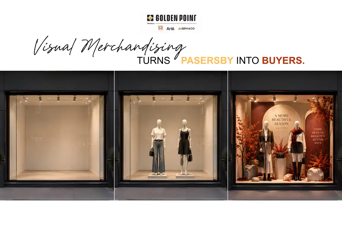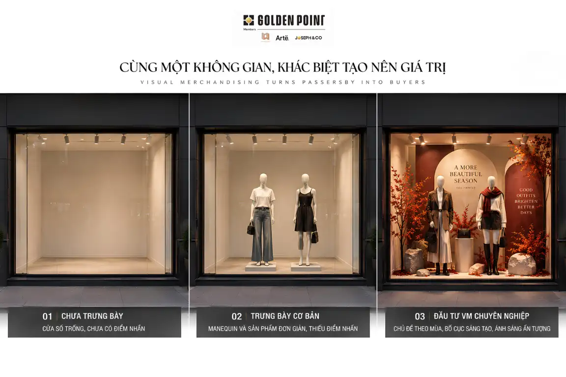
In retail, a store may have a great location, a wide storefront, and quality products, but that alone does not guarantee that shoppers will stop and look.
With so many brands competing for attention on the same street or inside the same shopping mall, the window display is one of the first touchpoints that can capture attention and give shoppers a reason to step inside.
An effective window display is not simply about putting beautiful products behind glass. It is a carefully planned visual composition designed to help shoppers see the right things, in the right order, within a very short amount of time.
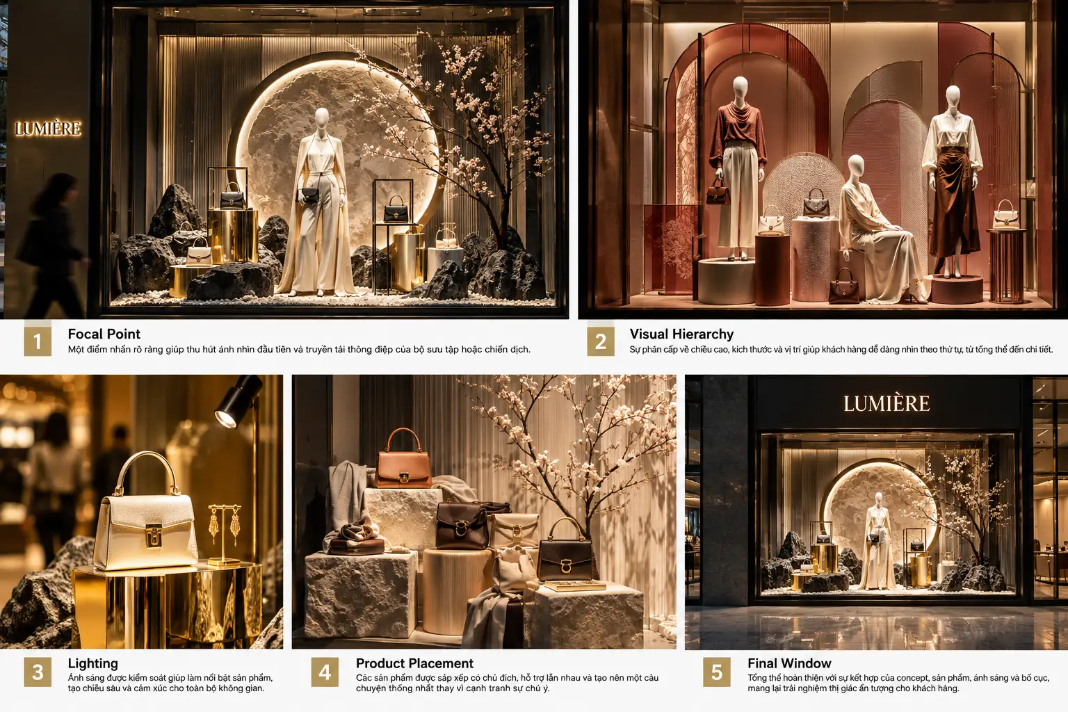
Focal point, visual hierarchy, lighting, and product placement all play an important role in making that happen.
What Makes a Window Display Get Noticed?!

1. A Window Display Is Not Just About Looking Good. It Needs to Get Noticed.
Picture a shopper walking through a shopping mall. They may be talking to someone, looking at their phone, searching for another store, or simply walking by. You only have a few seconds to get their attention. That is why a good window display needs to solve one basic problem first:
Can shoppers see and understand the idea behind the display at a glance?
A window display may look beautiful in a photo but still fail in a real retail environment if it contains too many products, too much information, or no clear focal point. On the other hand, a simple layout with strong visual hierarchy can create a much stronger impact.
In Visual Merchandising, the goal is not to fit as much as possible into the window.
The goal is to control where the shopper looks.
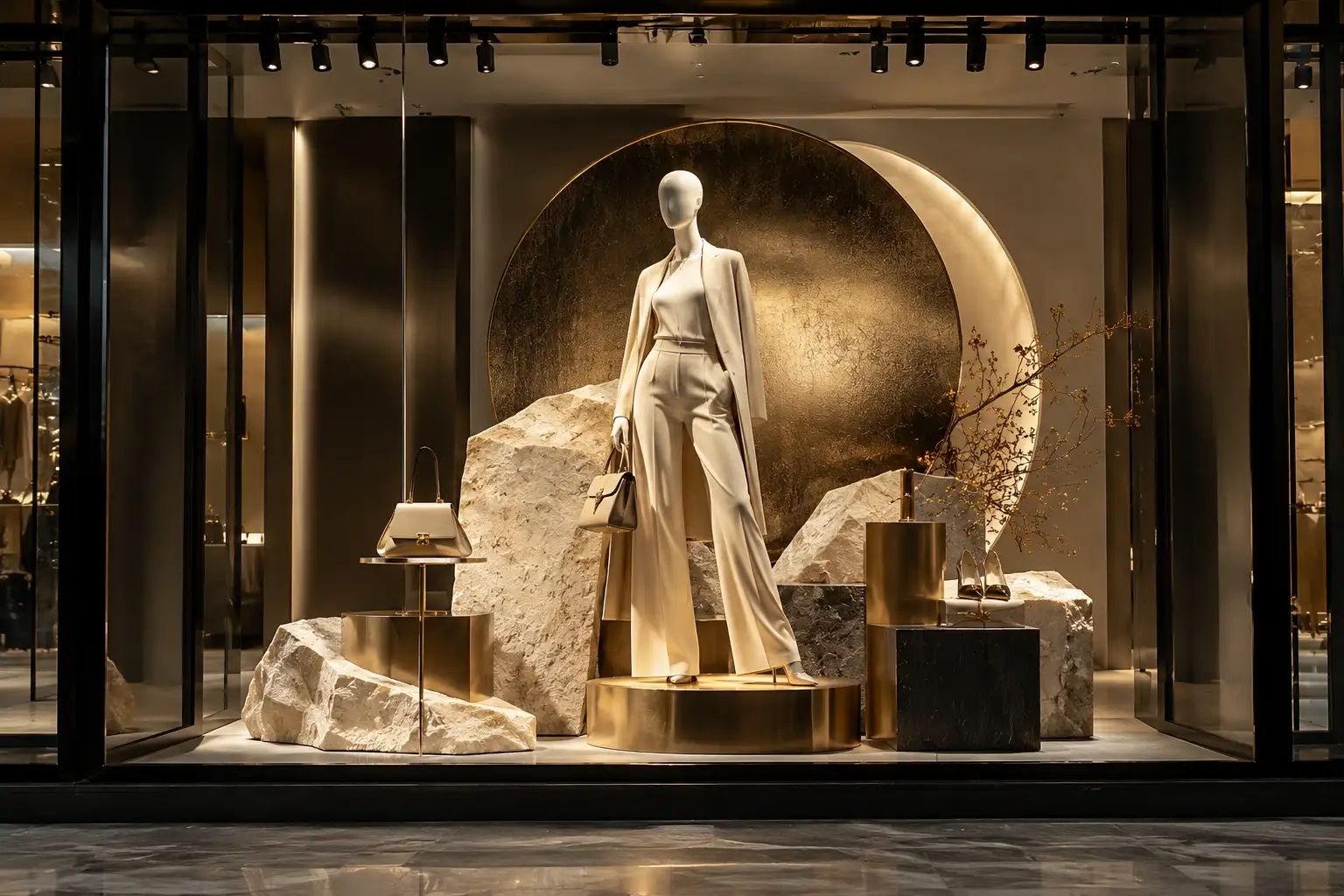
2. Focal Point – Shoppers Need to Know Where to Look First
One of the most important principles of window display is the focal point — the visual element that gets noticed first.
A focal point is a specific area or element designed to attract the first glance. It could be a hero product, mannequin, product group, graphic, logo, installation, or a key detail from the overall concept. When shoppers look at a window, they should not have to spend too much time asking: “What am I supposed to look at?”
A clear focal point helps communicate the display message faster. For example, if the goal of a campaign is to introduce a new collection, the hero product can be placed in the center or in the area with the strongest contrast. The other products support the main story instead of competing with it.
The focal point does not always have to be in the center. In many cases, placing it slightly off-center can create more movement and energy in the composition.
The question is not where the focal point sits. The question is whether it is clear enough to become the first thing people see.
A common mistake
Many window displays try to make everything a focal point.
- The mannequin is standing out.
- The product is standing out.
- The graphic is standing out.
- The background is standing out.
- The lighting is intense.
When everything is competing for attention, nothing really becomes the focal point.
A strong window display needs clear levels of importance between the hero, supporting elements, and background.
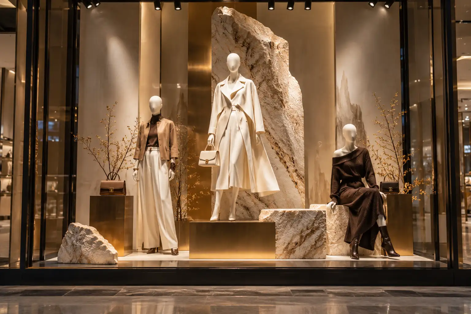
3. Visual Hierarchy – It’s Not Just What Shoppers See, but the Order They See It In
Once the focal point is established, the next step is building visual hierarchy. Simply put, visual hierarchy is how you arrange elements so the viewer naturally knows what to look at first, what to look at next, and what is there mainly as support.
A strong layout creates a natural visual journey. Shoppers may see the hero product first, then notice the supporting product group, then recognize the campaign concept or message, and finally discover the smaller details. Hierarchy can be created in many ways, including:
- Size
- Height
- Spacing
- Color
- Contrast
- Lighting
- Position
A mannequin that stands taller than the others creates a sense of hierarchy. A product with a bold color against a neutral background will get noticed faster. Even a well-placed empty space can make the product next to it stand out more.
In other words, visual hierarchy is how a window display guides the shopper’s eyes.
4. The Rule of Three and Intentional Product Grouping
In real-world VM, grouping products often works better than placing them randomly or individually.
A display can use three different levels or heights to create balance and movement. Differences in height keep the window from feeling flat and help guide the viewer’s eye from one area to another.
However, this does not mean every window needs to follow the same formula.
What matters more is that every product has a reason to be there. If a handbag is placed next to a mannequin, it should support the outfit. If an accessory is placed lower, it may help complete the visual story. If a product is placed farther away from the main group, that negative space should also serve the concept.
Product placement is not about filling space. It is about creating relationships between products.
5. Product Placement – Put Products in the Right Place So They Can Be Seen
A beautiful window display that fails to showcase the products is still not doing its job.
Product placement needs to answer a few basic questions:
- What is the hero product?
- What should shoppers see first?
- Which products should be seen together?
- Is there enough space for each item to be clearly seen?
One of the most common mistakes is putting too many products into the same area. When products are placed too close together, each item loses its visual space. Instead of seeing individual products, shoppers see one crowded composition.
On the other hand, the right amount of negative space can make products feel more valuable and visually important. This is especially true in fashion, luxury, and premium retail.
Empty space is not wasted space.
It is part of the design.
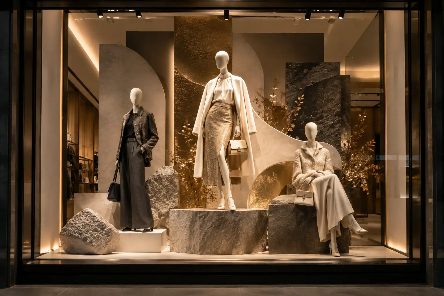
6. Mannequins Are More Than Display Props
In many fashion window displays, mannequins are the center of the composition. But how they are positioned has a major impact on the overall look and feel of the display.
When all mannequins stand at the same height, face the same direction, and use the same pose, the display can easily feel static and flat.
Small changes in height, orientation, spacing, and gesture can make the entire window feel more dynamic. A strong mannequin group does not necessarily need to “stand perfectly.” It needs to tell a story.
Shoppers should be able to imagine how the products are worn, how the pieces work together, and what the brand is trying to communicate.
That is the difference between simply displaying clothes and creating a fashion story.
7. Lighting – When Light Becomes a Tool for Direction
Lighting is often treated as the final step in completing a window display. But in reality, lighting should be considered from the concept stage. Lighting can completely change how a product appears.
A product under direct light will naturally attract more attention than the surrounding area. Lighting can create contrast, highlight texture, reveal materials, or add depth to the background.
Most importantly, lighting needs to support the visual hierarchy.
When every area is lit with the same intensity, it becomes difficult for shoppers to understand what is important. The window may be bright, but it has no clear focus.
A well-controlled lighting plan, on the other hand, can create different levels of light and shadow, making the focal point stand out and guiding the eye in the intended order. This is especially important for materials such as glass, metal, leather, satin, and other reflective surfaces. The wrong lighting angle can create reflections and glare or make product details harder to see.
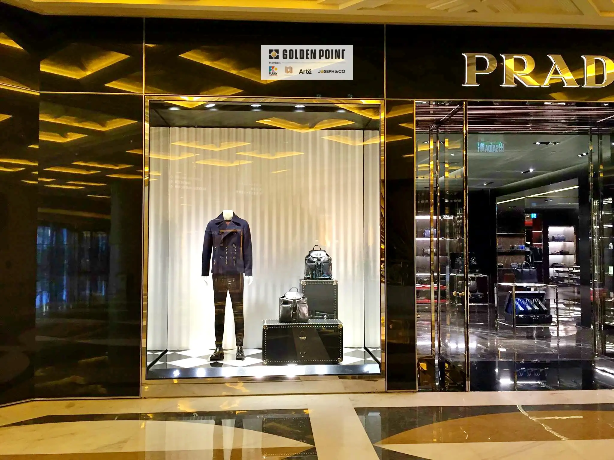
8. Color and Contrast – Grab Attention Before Shoppers Start Reading
People tend to recognize images, colors, and contrast before they start reading detailed information. That is why the color palette of a window display has a direct impact on how quickly it catches attention. A well-placed accent color can make a product stand out against a neutral background.
On the other hand, using too many strong colors at once can weaken the visual hierarchy. This also connects directly to brand identity.
A window display should not simply look good. It should look and feel on-brand.
Color, materials, graphics, lighting, and styling should all work together to create a consistent brand image. A strong window display is one where shoppers can feel the brand even before they see the logo.
9. Concept – The Element That Gives a Window Display a Story
Focal point, hierarchy, lighting, and product placement help a window display work visually. But to create a meaningful experience, all of these elements need to connect through a clear concept.
The concept may come from a campaign, season, collection, new product launch, or brand story. Once the concept is clear, many other decisions become easier:
- What should the background look like?
- Do we need props?
- How should the mannequins be styled?
- What mood should the lighting create?
- Which product should be the hero?
That is why effective VM usually starts with the idea first, followed by materials, styling, and decoration. Instead of asking: “Where can we fit more products?”
VM should start with a better question:
“What do we want shoppers to feel when they see this window?”
10. Don’t Try to Say Too Much in One Window
One of the biggest challenges in window display is knowing when to stop. Too many props, graphics, products, colors, and messages can make a window difficult to understand. Shoppers may see a lot, but remember very little.
A strong display does not necessarily need more elements. It needs the right elements.
Sometimes, a suitable background, two well-styled mannequins, one hero product, and a controlled lighting plan are enough to create a strong visual.
In VM, simplicity does not mean a lack of ideas. Very often, simplicity is the result of removing everything that is not necessary.

11. A Window Display Needs to Work From a Distance
One factor that is often overlooked is the real viewing distance. Shoppers are not always standing directly in front of the glass. They may see the window from 10–20 meters away, from the side, or while walking past. That means a display needs to be checked from different viewing distances.
- From a distance: Can shoppers recognize the focal point?
- From a medium distance: Can they understand the concept?
- Up close: Do the products and details still look interesting?
This is how VM moves from a design that looks good on a presentation board to a display that actually works in a retail environment.
12. What Does an Effective Window Display Actually Do?
The ultimate goal of a window display is not simply to make shoppers look at the glass.
What matters more is creating a sequence of reactions:
See → Notice → Understand → Feel → Enter
Shoppers see the window. Then they notice the focal point. They understand the story or product being presented. The visual creates a certain feeling. And finally, they have enough reason to step inside the store.
Not every window display will drive an immediate purchase. But a well-designed window display can serve as the first touchpoint between a brand and its customers.
And in an increasingly competitive retail environment, that first touchpoint matters more than ever.
From Window Display to Brand Experience
A good window display starts by capturing attention. A great one goes further by communicating the brand. That is why Visual Merchandising should not be viewed simply as store decoration.
VM is how a brand uses space, products, lighting, color, and visual communication to connect with shoppers.
- Focal point tells shoppers where to look.
- Visual hierarchy tells them what to look at next.
- Product placement makes each product clear and intentional.
- Lighting creates mood and guides the eye.
- Concept brings everything together into one consistent story.
When these elements work together, a glass window is no longer just part of a storefront.
It becomes a brand touchpoint.
Conclusion
A window display that makes people stop does not have to be large, complicated, or filled with details. What matters is intentionality.
Shoppers need to know what the focal point is. Products need enough space to be seen. Lighting needs to guide attention instead of simply making everything brighter. Colors and materials need to support the concept. And the entire display needs to tell a story that is consistent with the brand.
Because in Visual Merchandising, the question is not only: “Does this window look good?” It is also:
“What will shoppers see first, what will they feel, and what will give them a reason to step inside?”
That is when a window display truly starts doing its job.
From Window Display to Brand Experience
A window display that makes shoppers stop does not need to be large, complicated, or packed with details.
What matters is that every element has a purpose — from focal point, visual hierarchy, and product placement to lighting and how the concept comes to life in the space.
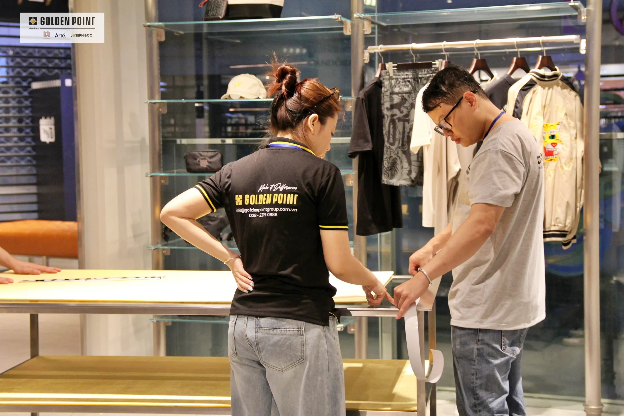
At Golden Point, we see Visual Merchandising as a process that connects concept to execution.
Our team works across Window Display, Hoarding, In-Store Visual, POSM, Signage, and Custom Fabrication, connecting design ideas with materials, production, and installation to ensure the final visual is delivered consistently at the point of sale.
With experience working with brands across fashion, luxury, and retail, Golden Point focuses on every part of the execution process — from material selection and color control to lighting, production, installation, and final finishing.
This is how we turn a design on paper into a real brand experience in the retail space.
Explore Golden Point’s Visual Merchandising services and project portfolio to learn more about how we bring ideas from concept to the real-world retail environment.