What do the Pyramids of Giza and Da Vinci’s Mona Lisa have in common with X (formerly Twitter) and Pepsi? Quick answer:They are all designed using the Golden Ratio.
The Golden Ratio is a mathematical ratio. It is commonly found in nature, and when used in a design, it fosters organic and natural-looking compositions that are aesthetically pleasing to the eye. But what exactly is the Golden Ratio and how can you use it to improve your own designs?
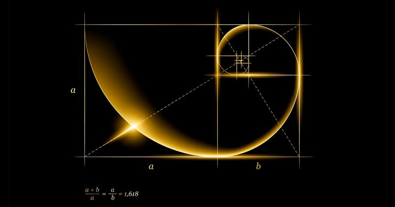
Putting it as simply as we can (eek!), the Golden Ratio (also known as the Golden Section, Golden Mean, Divine Proportion or Greek letter Phi) exists when a line is divided into two parts and the longer part (a) divided by the smaller part (b) is equal to the sum of (a) + (b) divided by (a), which both equal 1.618.

The formula for the Golden Ratio
But don’t let all the math get you down. In design, the Golden Ratio boils down to aesthetics— creating and appreciating a sense of beauty through harmony and proportion. When applied to design, the Golden Ratio provides a sense of artistry; an X-factor; a certain je ne sais quoi.
This harmony and proportion has been recognized for thousands of centuries:from the Pyramids in Giza to the Parthenon in Athens; from Michelangelo’s The Creation of Adam on the ceiling of the Sistine Chapel to Da Vinci’s Mona Lisa; and from the Pepsi logo to the The definition of Golden Ratio(opens in a new tab or window). Our bodies and faces even follow the mathematical ratio:

The Science Forum
In fact, our brains are seemingly hard-wired to prefer objects and images that use the Golden Ratio(opens in a new tab or window). It’s almost a subconscious attraction and even tiny tweaks that make an image truer to the Golden Ratio have a large impact on our brains.
The Golden Ratio can be applied to shapes too. Take a square and multiply one side of by 1.618 and you get a rectangle of harmonious proportions:

The rectangle of harmonious proportions
Now, if you lay the square over the rectangle the two shapes will give you the Golden Ratio:

If you keep applying the Golden Ratio formula to the new rectangle on the far right of the image above, you will eventually get this diagram with progressively smaller squares:

Whoa! Need a break? Hold on, just a few mind-bogglers to go.
If you take our Golden Ratio diagram above and draw an arch in each square, from one corner to the opposite corner, you will draw the first curve of the Golden Spiral (or Fibonacci Sequence) – a series in which the pattern of each number is the sum of the previous two numbers. Starting at zero, the sequence is:0, 1, 1, 2, 3, 5, 8, 13, 21, 34, 55, 89, 144… and so on.
By adding the arch in each square, you’ll end up with the diagram of the Golden Spiral:

The Golden Ratio Spiral
You’ll find this beautiful creature throughout nature's forms—ferns, flowers, seashells, even hurricanes—which perhaps why we find it so visually appealing. Because it is, indeed, nature at its finest.

The Golden Ration occurs naturally in nature.
Now, go one step further and trace a circle within each square—then you’ll have circles that follow the 1:1.618 ratio and are in balanced proportion to each other.

The Golden Ratio Circles
So now we’ve got squares, rectangles, and circles that all follow the Golden Ratio and sprinkle the magic (number) on your design.
Done with the explanations?
Now that you’ve been beaten over the head with the theory behind the Golden Ratio, let’s get down to figuring out how it can be used to improve your designs.
You can apply the Golden Ratio to many compositional elements of your design, including layout, spacing, content, images and forms.
Consider the Golden Ratio a useful guideline for determining dimensions of the layout. One very simple way to apply the Golden Ratio is to set your dimensions to 1:1.618.>
For example, take your typical 960-pixel width layout and divide it by 1.618. You’ll get 594, which will be the height of the layout.
Now, break that layout into two columns using the Golden Ratio and voila! Working within these two shapes your layout will abide by the harmonious proportions of the Golden Ratio.

The two-column layout is an example of the Golden Ratio in action.
The two-column layout is well suited to web design and you’ll see much online content in this format. National Geographic(opens in a new tab or window) has certainly adopted the layout and uses it for a clean, easy-to-read, well-organized website. It provides readers with a website that has a natural sense of order, balance and hierarchy.

The National Geographic website makes use of the Golden Ratio. Look closely.
Check out the Greyscale Photo Typography Book Cover(opens in a new tab or window) and the Greyscale Skyscrapers Teen Fiction Wattpad Book Cover(opens in a new tab or window) templates.
Related article:100 brilliant color combinations and how to apply them to your designs(opens in a new tab or window)
Spacing is an all-important element of any design, be it the use of negative or positive space(opens in a new tab or window), and it can often make or break the final result. Determining the spacing of elements can be a rather time-consuming affair; instead, start with the Golden Ratio diagram and let the squares guide where you place each element. This will ensure your spacing and proportions are calculated, rather than ‘instinctual’, as any minor tweaks towards achieving the Golden Ratio can make all the difference.
Plus, if you’re dealing with several elements, you can layer several Golden Ratio diagrams in order to continue consistent proportions throughout your design.

Design studio Moodley(opens in a new tab or window) developed a brand identity for the performing arts festival Bregenzer Festspiele that included a logo(opens in a new tab or window), logotype and collage design applied to programs, playbills and outdoor campaigns. The playbill features photographic and illustrative collages and a rippled logo with plenty of unprinted space. The Golden Ratio is used to determine the size of and placement of each element to ensure a well-proportioned cover.

Bregenzer Festspiele by Moody
Singapore-based design agency Lemon Graphic(opens in a new tab or window) created a visual identity for Terkaya Wealth Management. Here, the three design elements of the business card – the small eagle, the text and the large eagle – all fit into a different section of the Golden Ratio.
Plus, lay a Golden Ratio over the small eagle and it also fits within the proportions.

Terkaya by Lemon Graphic
Get your brand out there with the Midsummer Music Festival(opens in a new tab or window) and the Orange Photo Event Planner Business Card(opens in a new tab or window) templates.
Related article:10 common myths about graphic design(opens in a new tab or window)
The Golden Spiral can be used as a guide to determine the placement of content. Our eye is naturally drawn to the center of the spiral, which is where it will look for details, so focus your design on the center of the spiral and place areas of visual interest within the spiral.

This website by and for graphic designer Tim Roussilhe(opens in a new tab or window) looks quite content-dense but is very well organized according to the Golden Ratio and Golden Spiral, which focuses on the text in the upper left section of the website. Your eye begins in the top-center with “Bonjour My Name is Tim.” It then travels past the description of what Tim does, on to the menu buttons, hits the logo in the top-left corner, before coming to rest in negative space, having absorbed all the details it needs.

Bonjour My Name is Tim
Content most obviously becomes denser as the spiral progresses in this visual identity for Saastamoisen säätiö(opens in a new tab or window). The size of each letter is reduced as is the spacing between each letter as the eye gets closer to the spiral. The letters don’t necessarily read in order but there is enough repetition that it will become familiar.

Saastamoisen säätiö
Helms Workshop(opens in a new tab or window) designed this branding for Fullsteam Brewery and used the Golden Ratio and Golden Spiral for layout and content. Various elements of the design fit within separate squares and the eye is drawn past the main character, to the stamp, the ABV, and place of manufacture. Helms Workshop’s intention for Fullsteam was create a “brand narrative around a semi-fictitious steampunk plantation-owner from a distant name…” The Golden Spiral helps tell the narrative on the label as we pick up detail about both him and the brand.

Fullsteam Brewery by Helms Workshop
A well-balanced design can efficiently present information more clearly. Try the Orange Modern Travel Trifold Brochure(opens in a new tab or window) and the Light Blue Photo Medical Brochure(opens in a new tab or window) templates.
Related article:5 principles of design and what they can do for you(opens in a new tab or window)
The composition is important for any image, whether it’s to convey important information or to create an aesthetically pleasing photograph. The Golden Ratio can help create a composition that will draw the eyes to the important elements of the photo. Using the Golden Ratio, you split the picture into three unequal sections then use the lines and intersections to compose the picture.
The ratio is 1:0.618:1 – so the width of the first and third vertical columns will be 1, and the width of the center vertical column will be 0.618. Likewise, with the horizontal rows:the height of the first and third horizontal rows will be 1, and the width of the center row will be 0.618. Now use those lines and intersections to draw the viewer’s eye and focus attention. It also creates tension and adds interest and energy to composition.

Another (and slightly simplified) way to crop images(opens in a new tab or window) via the Golden Ratio is to use the Rule of Thirds. It is not as precise as the Golden Ratio but it will get you pretty close. For the Rule of Thirds, set up all vertical and horizontal lines to 1:1:1 so that all spaces are equal and even. Align important elements of the image around the central rectangle ideally at its four corners.
This cover for Complex magazine, featuring Solange Knowles, uses the Golden Ratio to determine the proportion of positive and negative space. The top of Solange’s nose and (almost) her forehead reach the top horizontal line; while her nose and eye fall on the two vertical lines around the center rectangle.

Complex Magazine
Jason Mildren(opens in a new tab or window) designed this cover for Pilot magazine and it works with the Rule of Thirds. There is interest at the corners of the center rectangle, while that center, for the most part is empty. The model’s eye falls exactly on one corner and is piercing at the audience.

Pilot Magazine by Jason Mildren
This cover of Feld magazine uses the Golden Ratio cropping to center the eye of the model on the cover. It works well because he is off center and the side of his face almost aligned with the left vertical guide.

Feld Magazine
And overall, the layout of the cover follows the Golden Ratio and Golden Spiral. Content is concentrated within the spiral and it becomes more detailed towards the center of the spiral.

Feld Magazine
Get the look with the Typographic Quote Social Media Graphic(opens in a new tab or window) and the Olive Green Diamond Hug Your Cat Day Social Media Graphic(opens in a new tab or window) templates.
Related article:The first 4 questions experts ask themselves before designing anything(opens in a new tab or window)
Just like the Golden Ratio can be harnessed to create squares and rectangles that are in harmonious proportion to each other, it can also be applied to create circles. A perfect circle in each square of the diagram will follow the 1:1.618 ratio with the circle in the adjacent square.

The Golden Ratio Circles
Using the Golden Circles will create not only harmony and proportion but also consistency throughout the form. Let’s go back to Pepsi and X (Twitter) here.
The Pepsi logo is based on two intersecting circles that follow the Golden Ratio. While the smaller circle is not readily evident in the final iteration is does form the basis of the white slice through the center of the logo.

The Pepsi logo with the Golden Ratio
The Twitter logo uses geometry and is heavily based on perfect circles(opens in a new tab or window). There is a minor lack of precision when aligning it with the Golden Ratio but for the most part, the Twitter logo seemingly uses Golden Circles for balance, order, and harmony.

Twitter logo and the Golden Ratio
You can use various elements of the Golden Ratio to design better. The tweaks may be subtle, but that might be all it takes to go from good design to great design, especially in the eyes of the beholder.
As György Dóczi writes in The Power of Limits, “The power of the golden section to create harmony arises from its unique capacity to unite different parts of a whole so that each preserves its own identity and yet blends into the greater pattern of a single whole.
In simple terms, the Golden Ratio is a mathematical ratio. It is abundantly present in nature, and when applied in design, it represents aesthetics, embodying the natural balance of creation. But have you ever wondered what the Golden Ratio truly is and how to use it to enhance your designs?
When it comes to print advertising, understanding the appropriate sizes is crucial for creating high-quality and engaging materials. This article will guide you through the considerations and benefits of adjusting print sizes to achieve satisfactory results.
In lighting design, a solid understanding of the applicable standards is the key to creating harmonious and efficient lighting spaces. With the continuous development of technology and modern design trends, mastering crucial design standards is not only necessary but also a determining factor for the impression of a space. Let’s explore and grasp these standards together to create innovative lighting spaces that touch every human emotion.
Everything in the office should be arranged, organized, and selected to achieve evenness and balance in a certain proportion. This principle is also applied to many small office design models.

In interior design, many consumers mistakenly perceive lighting design as simply selecting different types of lamps, determining wattage, choosing styles, and matching colors with the interior. However, in reality, this is an inaccurate concept.
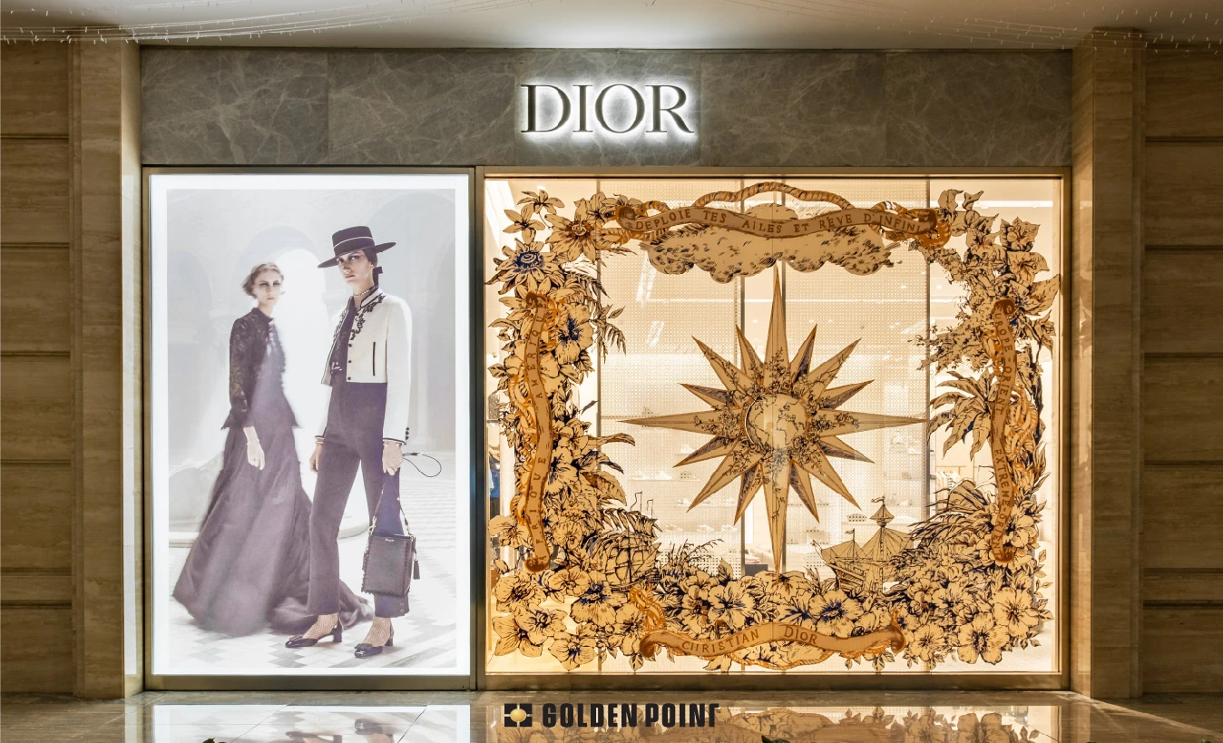
In the field of fashion retail, a fashion store front typically has 3 mannequins, IKEA arranges items like a home, … It’s not by chance that products are placed the way you see them. Each position in the store is carefully calculated to keep customers there longer, which translates to spending more. The job demands both creativity and a business mindset, and it belongs to visual merchandisers. In this article, find out how visual merchandising works, its impact on brands and revenue.

Surely you have come into contact with printed publications such as desk calendars, flyers, standees, etc. So have you ever wondered how these publications are created or who is behind these publications?
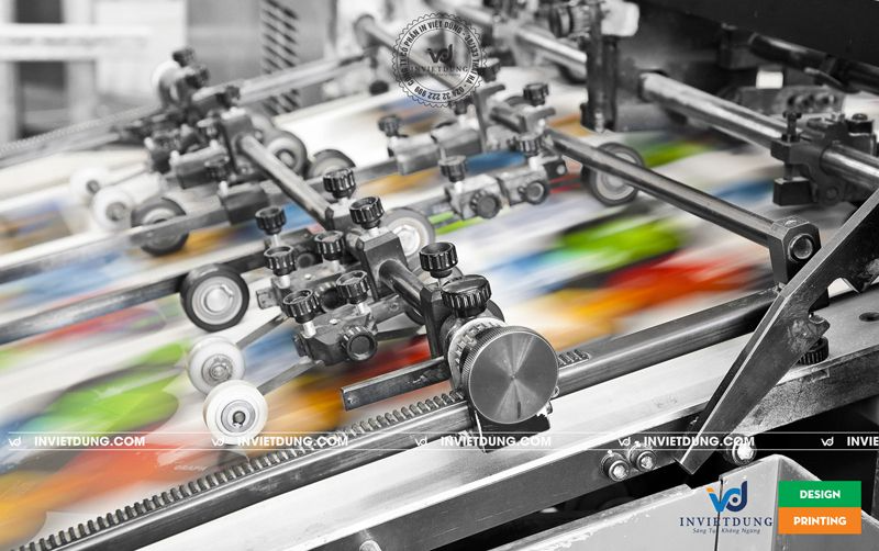
Offset printing is a printing technique in which inked images are transferred (offset) onto rubber sheets (referred to as offset plates) before being pressed onto paper. Nowadays, offset printing technology is widely used by printing companies in Hanoi.
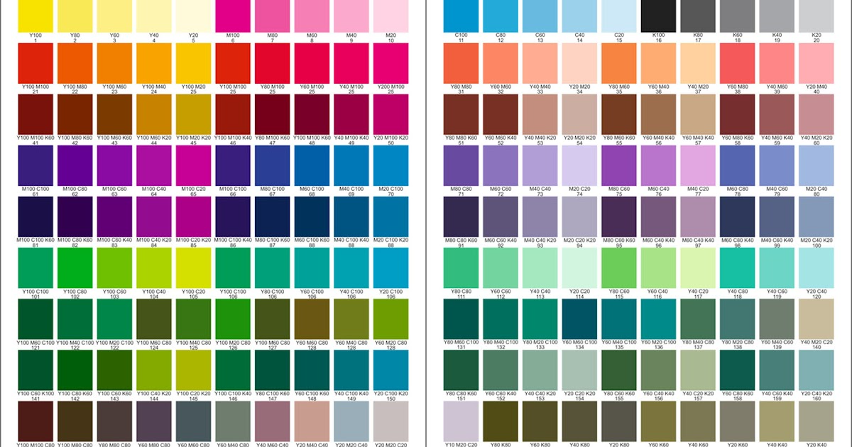
A beautiful piece of work, no matter how aesthetically pleasing, loses more than half of its value if not adorned with suitable colors. In printing, the criteria for color are even more critical. Therefore, the selection of printing colors always takes the most contemplative time in designs. The printing color palette is diverse and mystical. Let’s explore it through the following article.

Event organization is one of the popular and highly competitive industries in the job market that attracts the interest of many young individuals. It is also a crucial aspect of the advertising, communication, and entertainment services industry.

Before launching a new product, the first thing a business needs to do is market research to understand customer needs, current market trends, and competitors. This will help the business identify target markets and develop appropriate marketing strategies to promote its product.